
Giving two teachers-turned-founders a bold, kid-friendly brand that makes banned books and big conversations feel exciting, empowering, and impossible to ignore.
Problem Statement
Rebellious Young Readers is a book subscription box founded by two women educators who wanted to spark family conversations around banned books and socially important topics. Their idea needed a strong brand identity that could both honor their educational mission and capture the rebellious, punk-inspired energy of their name, while keeping it age appropriate.
Discovery & Exploration
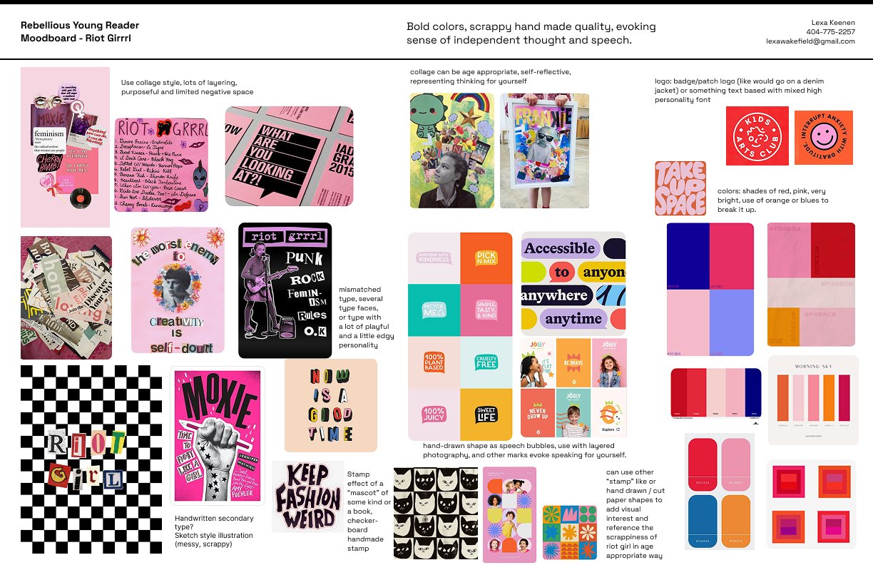
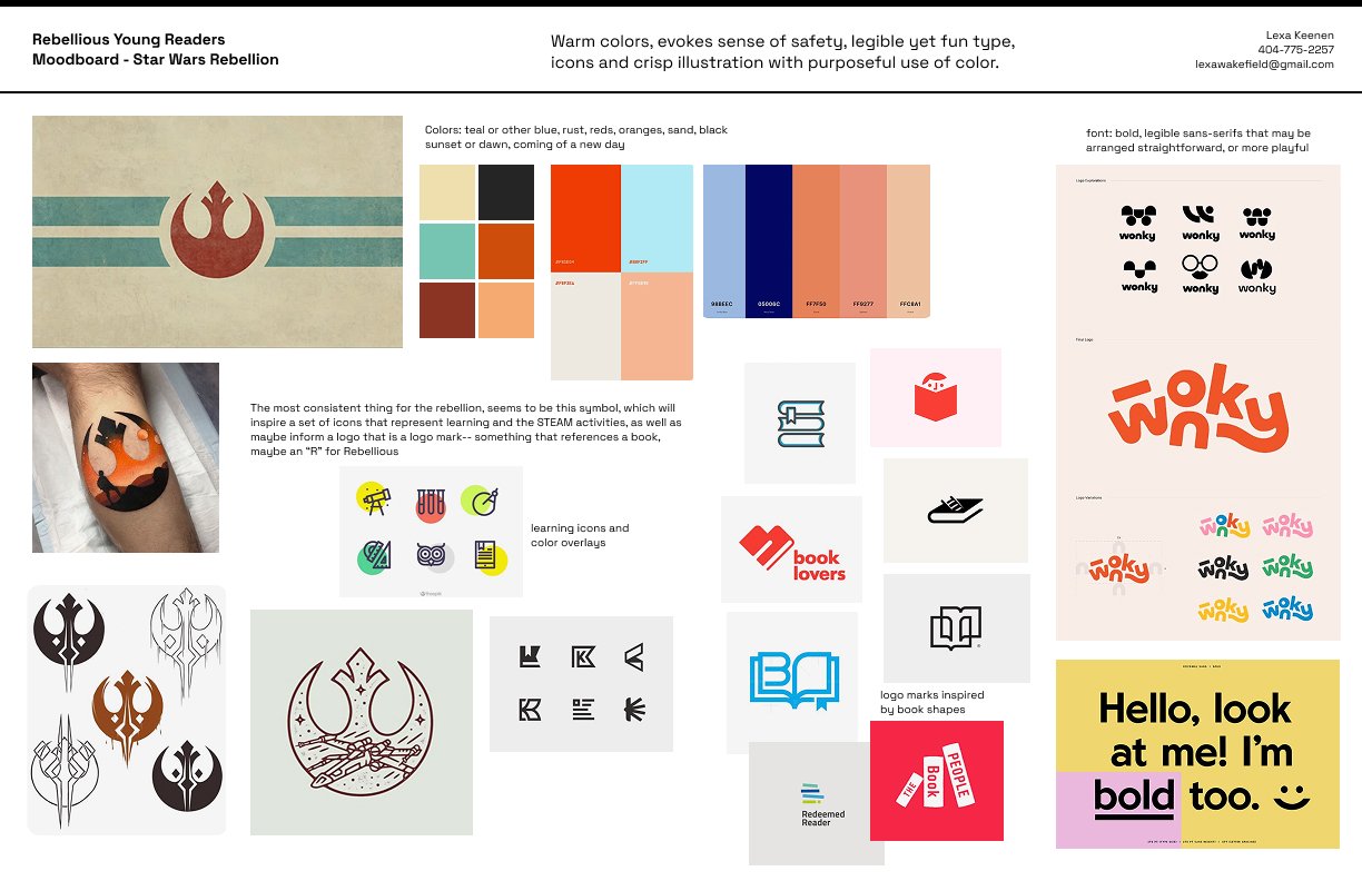
We kicked things off with a deep-dive conversation into their goals, competition, and vision for the brand. I learned what set them apart from existing subscription services: a focus on banned books, family discussion guides, and lessons designed by teachers. Together we defined the brand’s “vibes” as rebellious, educational, and parent-minded. We wanted the brand to feel edgy enough to stand out yet approachable for families. The founder and her husband had two inspiration themes: the riot grrrl movement and the rebellion from Star Wars. I used each of these as a theme for initial mood board concepts.
Design Direction
I explored multiple logo concepts, color palettes, and type combinations that balanced a rebellious edge with educational trust. A collage-style aesthetic, bold typography, and hand-drawn elements emerged as the most authentic direction.
Refinement
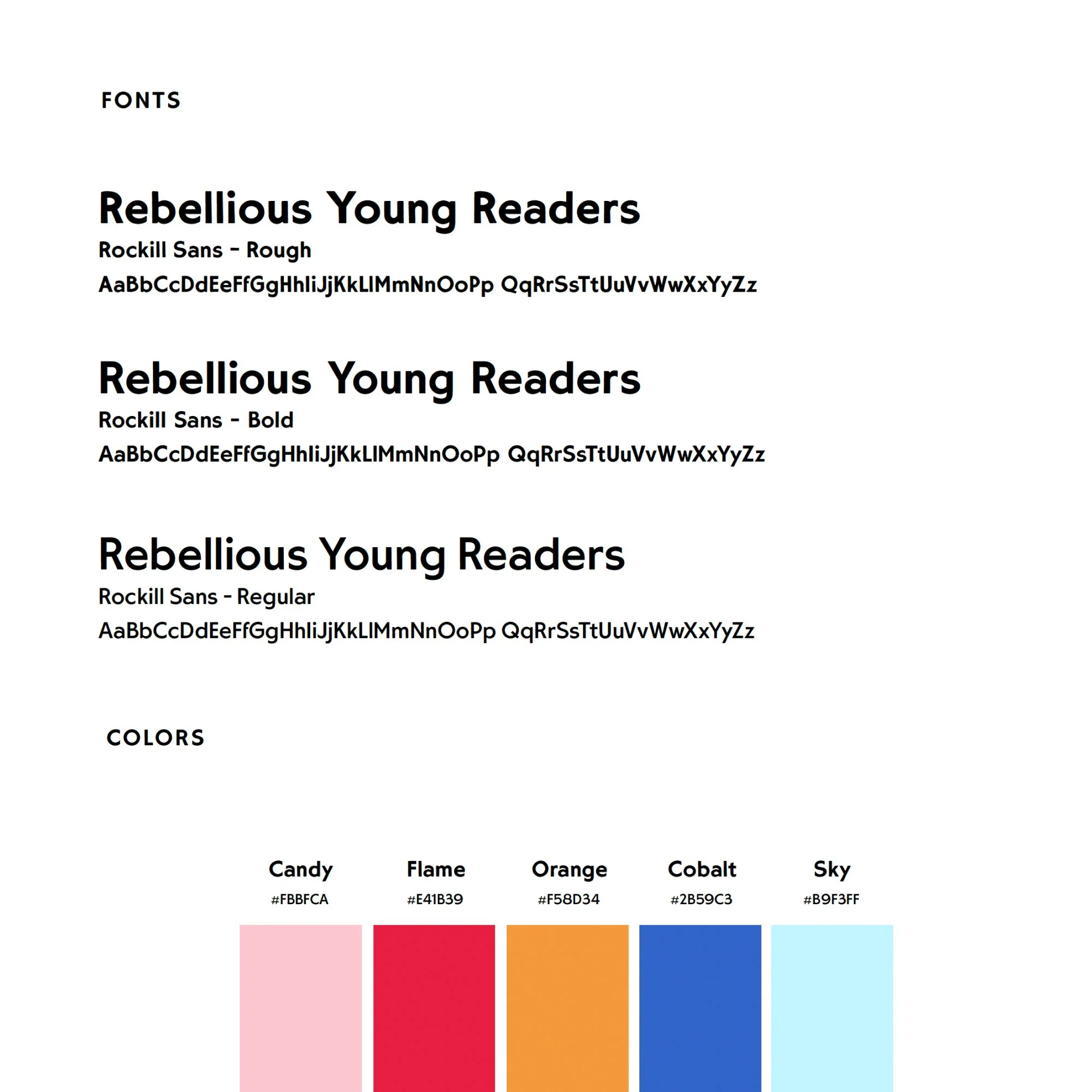
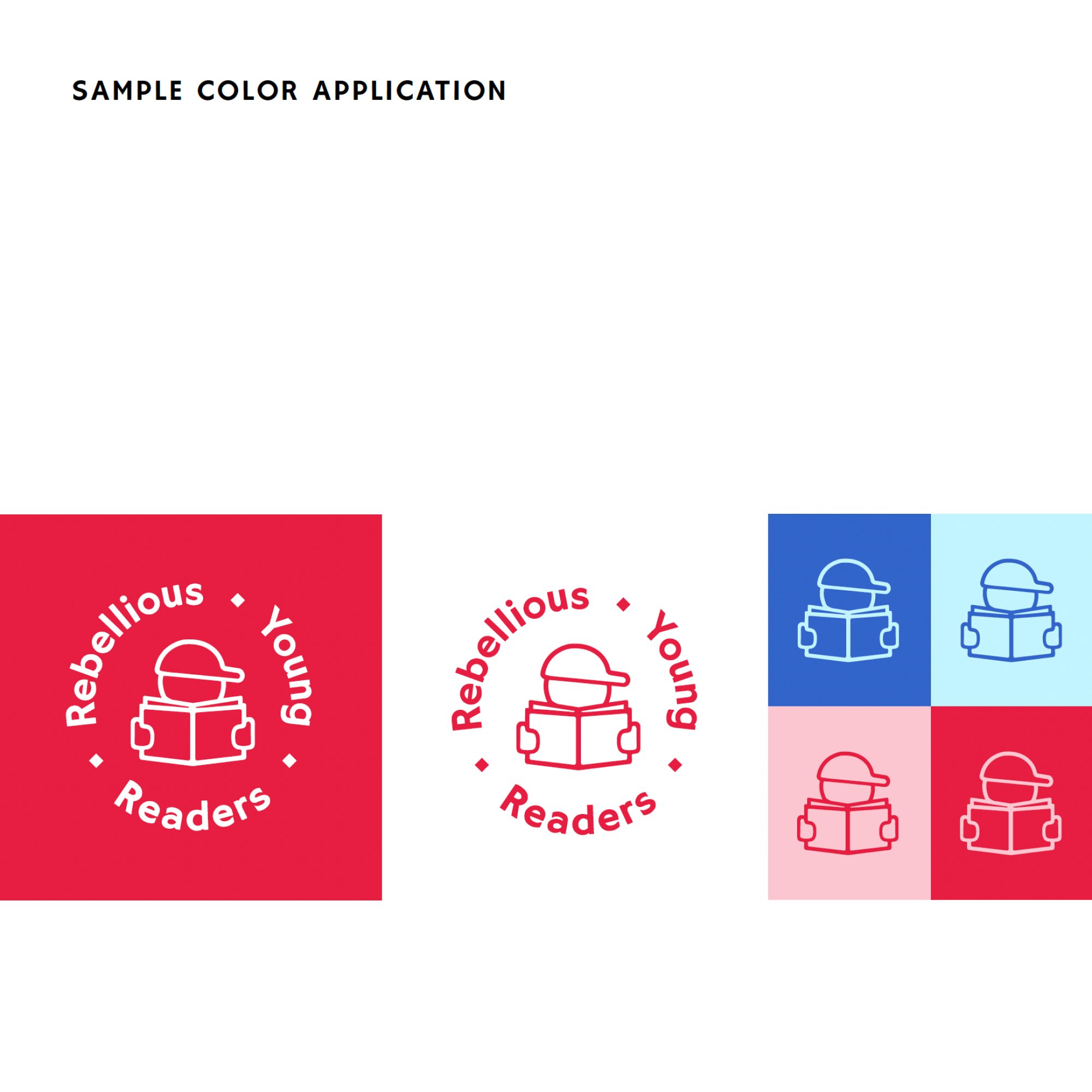
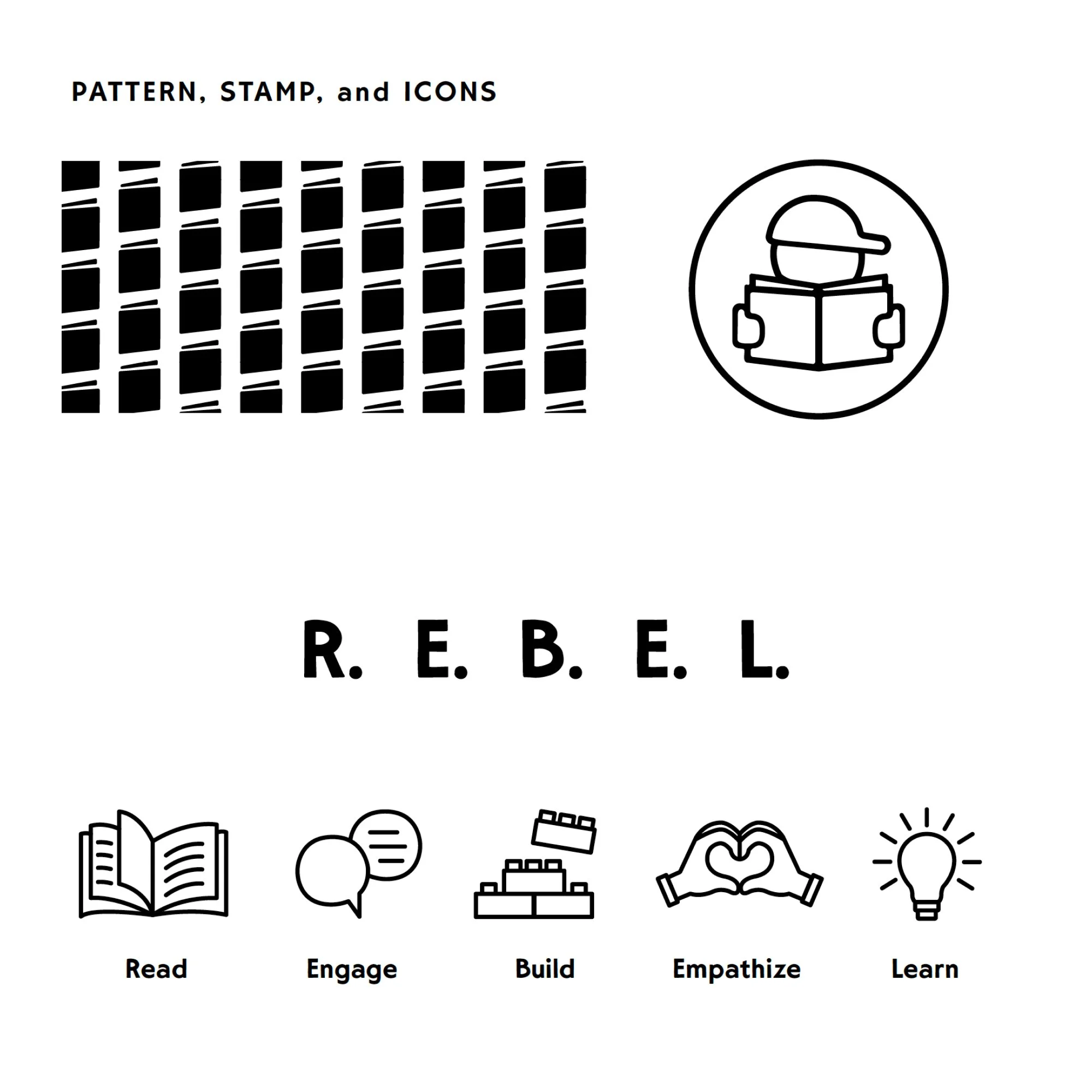
Through rounds of review with the founders, we arrived at a final brand system rooted in bold red, black, and orange tones with layered type and collage-inspired graphics. The final brand guide included:
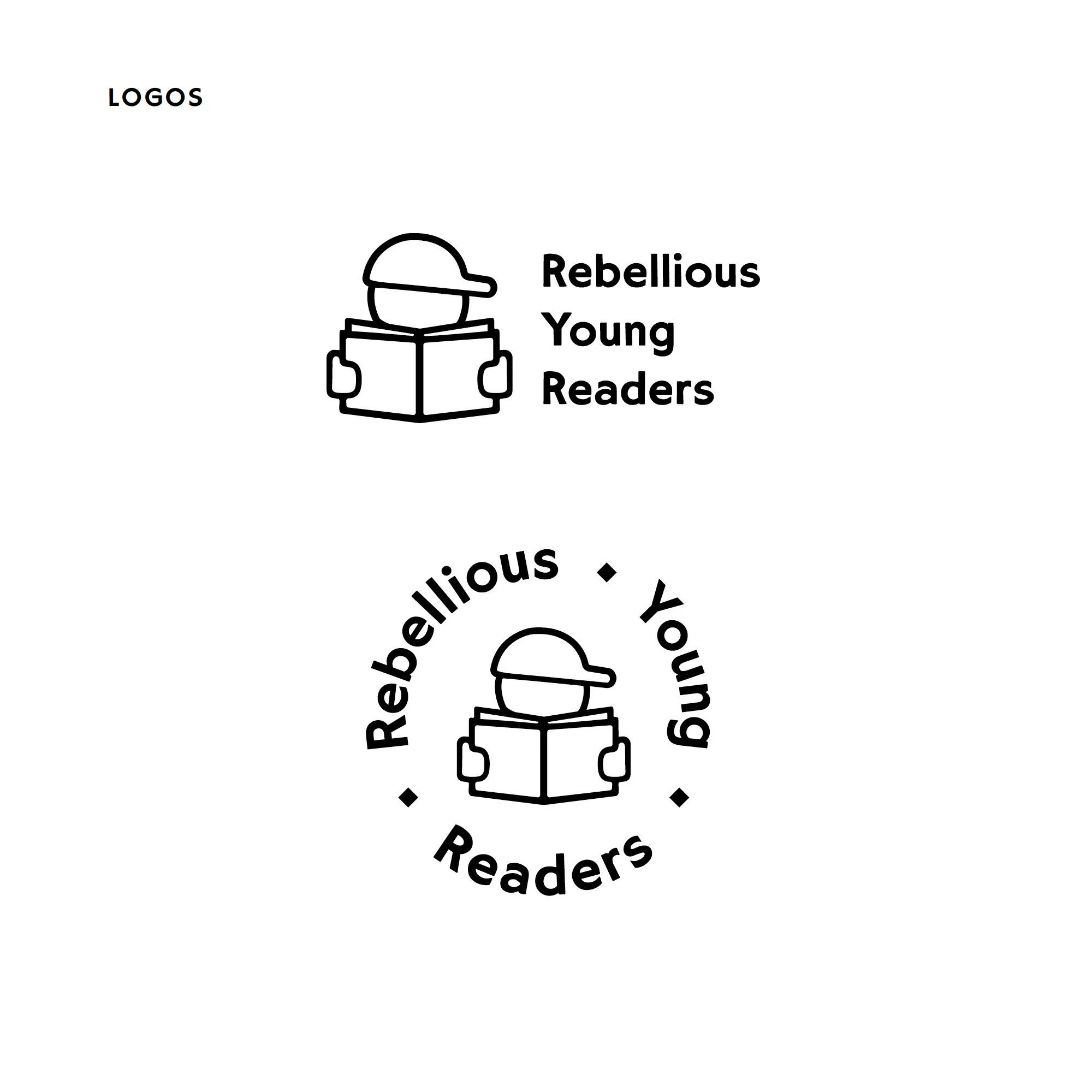
Logo family: primary logo, alternates, and badge-style variations
Typography system: expressive display fonts paired with clean supporting type
Color palette: bold, rebellious reds and oranges balanced with neutrals for flexibility
Graphic elements: hand-drawn accents and speech-bubble shapes evoking dialogue and independent thought
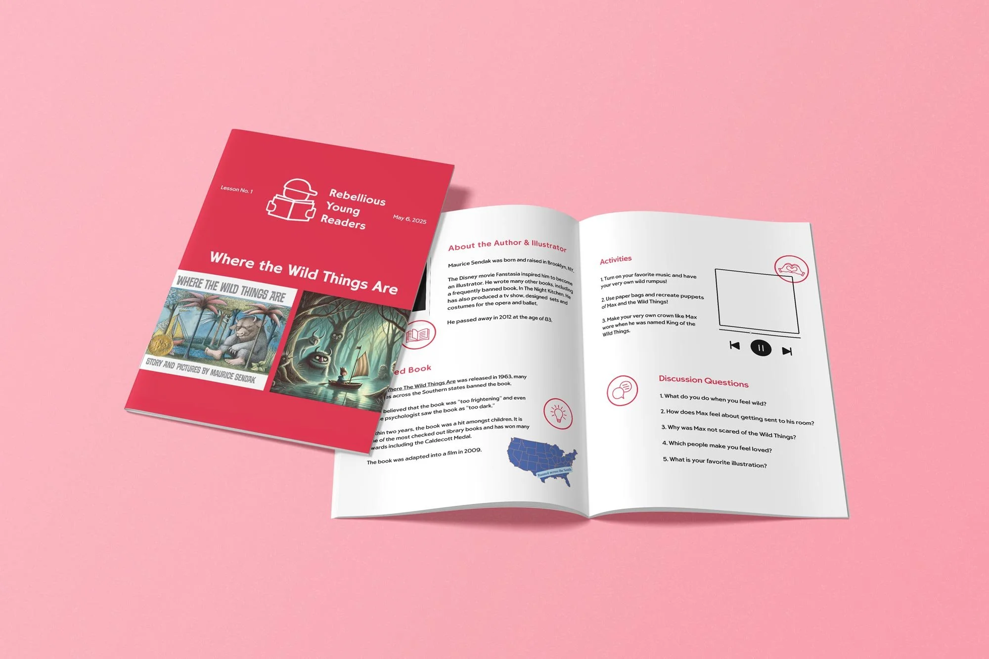
Once the brand was finalized, I applied it across a refreshed curriculum template, creating a system in Canva the founders could easily use themselves to design new lessons. This can be seen at the top of this case study.
Outcome
The new branding gave Rebellious Young Readers the professional foundation they needed to confidently launch their business. They visually stand apart from competitors while staying true to their mission. With a bold identity and the easy to use curriculum template, they are well-positioned to grow their audience of families and educators. For me, this was more than a branding project, it was about supporting women educators turned women entrepreneurs in bringing their vision to life.